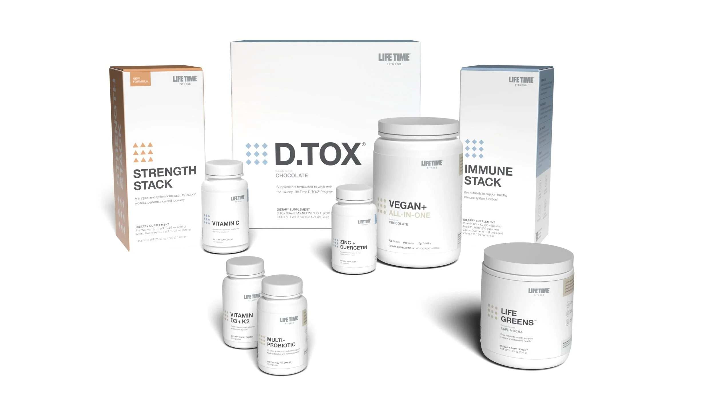
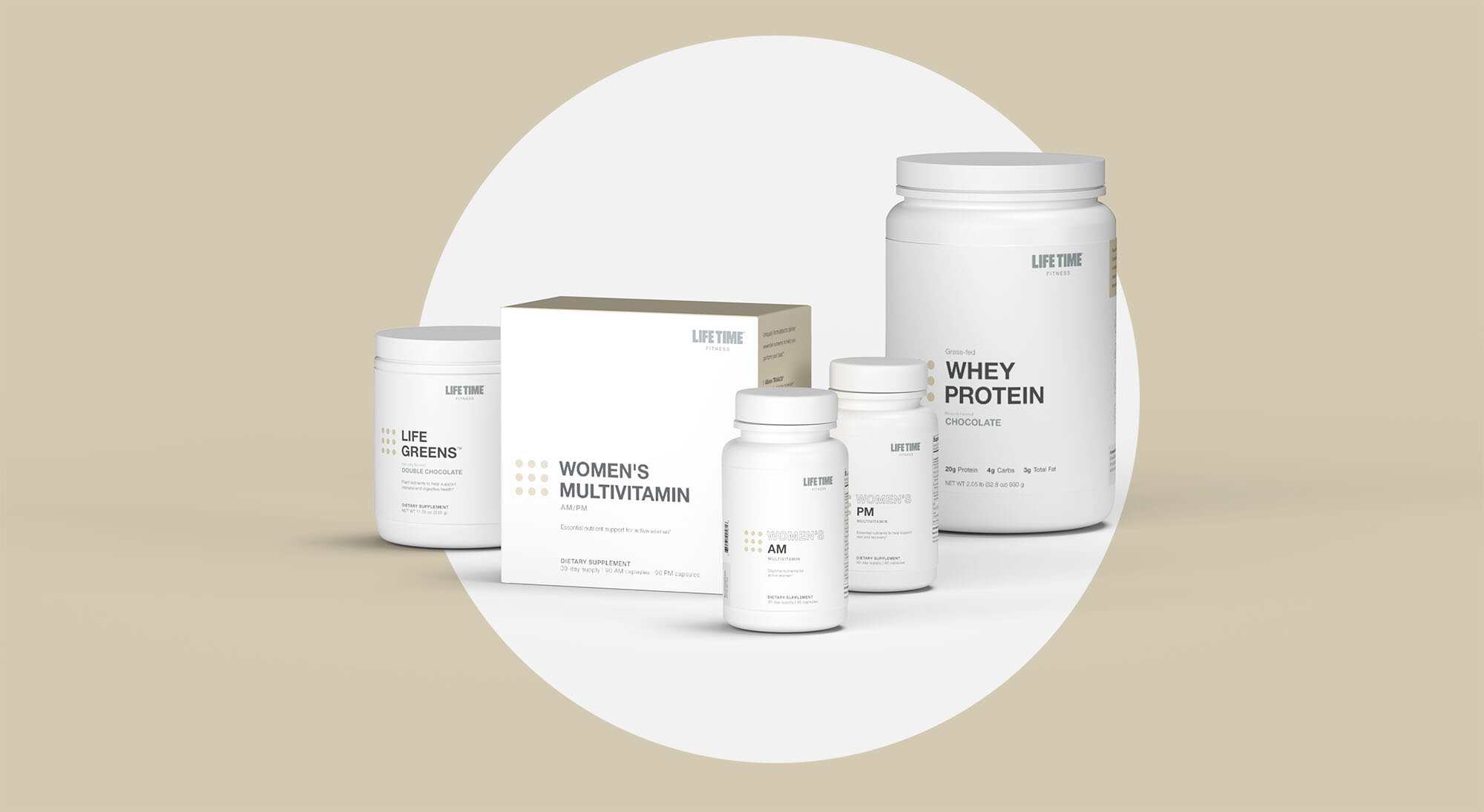
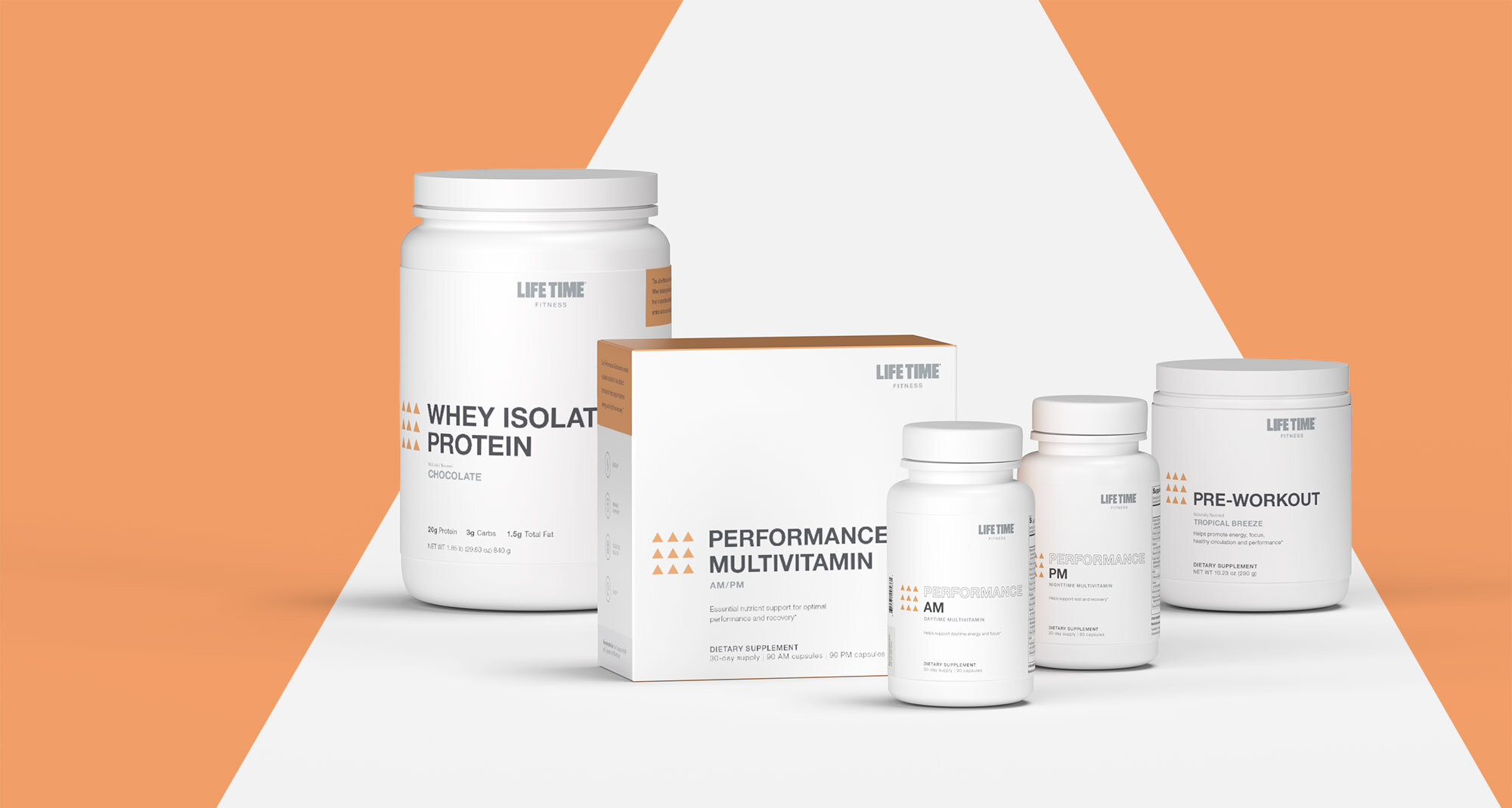
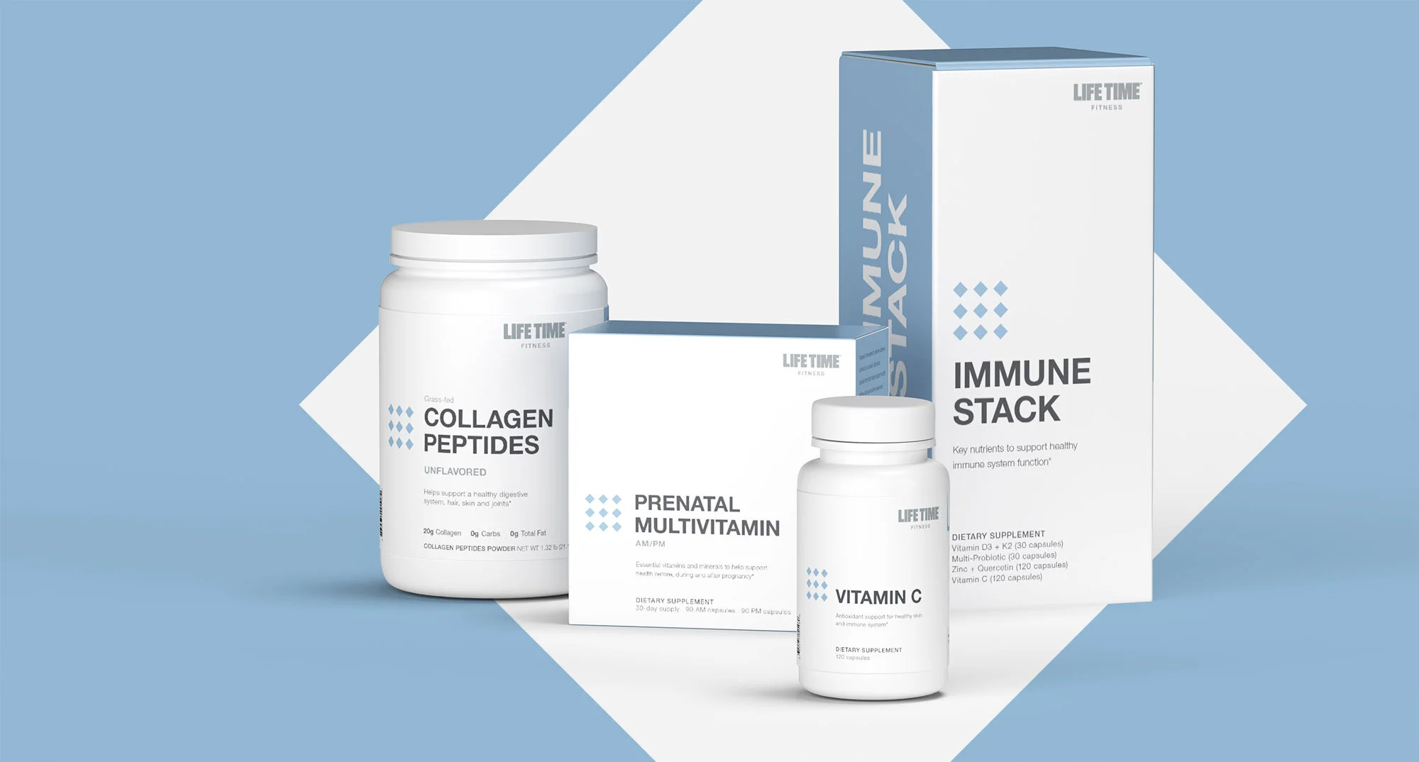
Just before the Covid-19 pandemic began, we were tasked with creating a new packaging design system for the Life Time supplements brand. This system needed to encompass over 40 SKUs, each with various use cases.
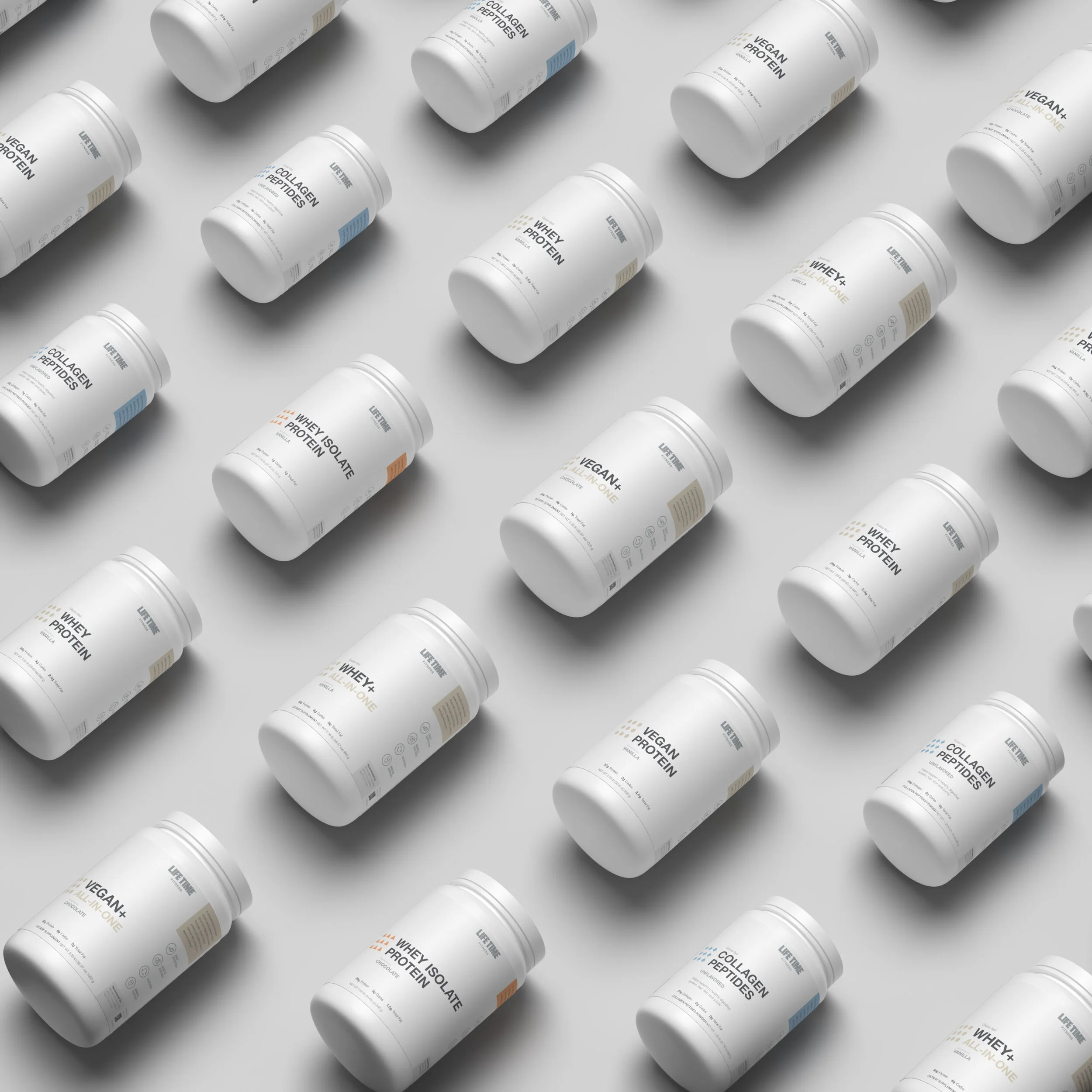
My design concept was chosen as the direction, and together with my Creative Director, Derek Wallen, we developed a cohesive system of labels and bottles for all package sizes, from small pill bottles to large protein powder tubs and boxes.
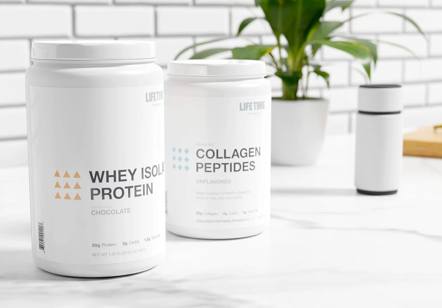
The product line was categorized into three groups: essential, performance, and specialty, each with its own distinct shape and color to define the subcategories under Life Time performance. We opted for a primarily white bottle and label to maintain a clean, modern aesthetic that aligned with Life Time's brand identity. This choice also helped differentiate our products from competitors, which often had bold and busy designs.
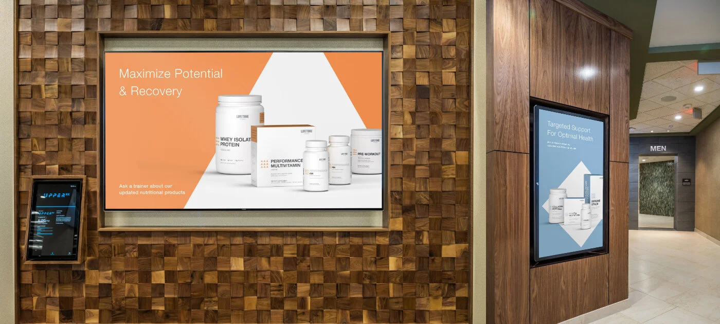
As we were about to enter production, the pandemic presented new challenges, such as limited product availability for photography, lack of space for shoots, and an increasing focus on digital presence over traditional retail.
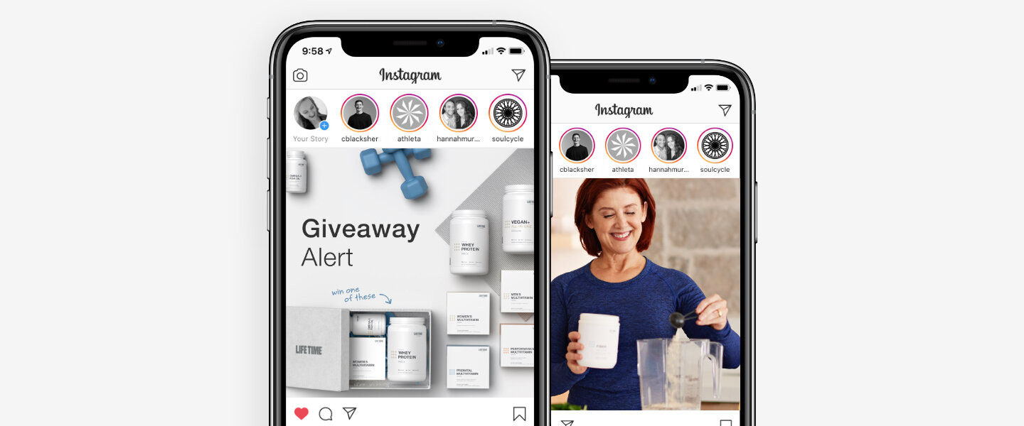
Fortunately, I had been teaching myself 3D design software, starting with Adobe Dimension, which allowed me to create initial product imagery for advertising in clubs and online. This quickly evolved into learning Blender 3D for more advanced renders used in news articles, online retail, in-store advertising, and beyond.

